Dating techniques have placed it at the start of the 1920's, but other that that we know nothing. To this end, slightly 'chard has enlisted the help of two notable art critics (would have been 3 but she didn't phone) to provide their own takes on just what this art is meant to represent, Stompp and Helen Oxenham PhD. First up, for we in the upper classes believe ladies should come first...well, so Sarah managed to pursuade me...ahem anyway, yes here we present the study from Helen Oxenham MA:
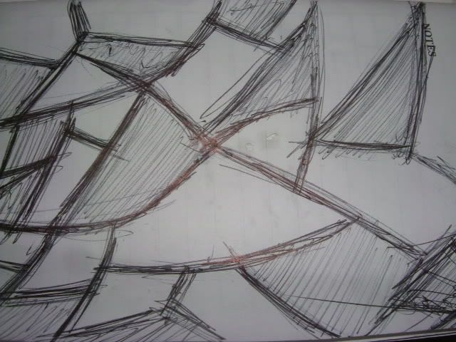
This, like many of the more successful pieces of art created in these days of creative fluidity, is not just a pretty picture. Rather it provokes an intimate reflection of society in this, the ever increasingly multi cultural Britain, providing insights into the more troubled aspects of race relations. The jagged lines gradually overflowing from white to black spaces show the ever persistent problems of the ghetto syndrome, the isolating of minorities until the oppression they face causes them to rebel, as shown in the race riots following apartheid in the USA. However, the central line, to which the eye is immediately drawn, is smoother, more intense, showing that still there is hope, the climate of violence is decreasing and a more neutral society taking hold. Of course this work is open to great interpretation, and this in itself proves its own success – the artist clearly wished to make people take notice, debate and such is the case. This is true contemporary art, the art of our times.
Attributed to an artist of unknown origin, this fascinating piece reveals insights into the human condition most composers of graphite can only dream of achieving: the coarse, complex layers (interwoven with a somewhat nonchalant attitude, or at least melancholy to the extent of inducing an overwhelming sense of lethargy) portray the diminished dignity an individual experiences through the tragic loss of innocence that exists within an adult world, a world of monotone shades and jagged, broken souls. Eschewing intense colour in favour of stark, geometric statements we can consider the mind of its creator (whomever genius that may have been – I suspect Picasso given the sheer spectacle of it all) to be in an aggressive temperament, seeking one thing only – to make a point by standing against the status quo of the art world, and to do it in such a way as to bewilder and awe onlookers with confidence and fidelity. This is the future of graphic representation, and as a timeless classic should never be forgotten.- Stompp 2006

And THIS

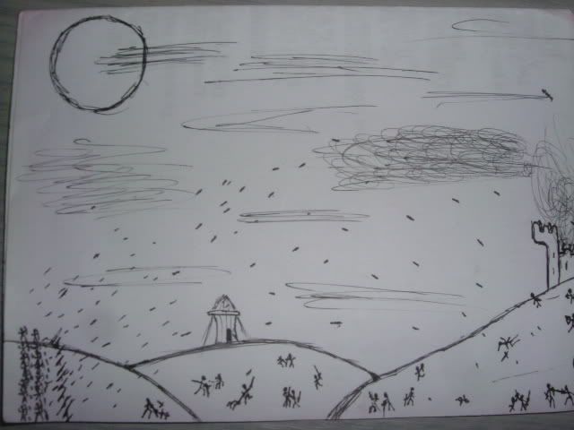
And THIS trash!

As Stompp put it after correcting me (correctly) on my passionate hate: "concept art is the small, bitchy sister of real art that gets all the attention". Why cant we have real art? Like this sterling work?
Ah well. Not much I can do. Once I'm no longer forced to be in the same room as Jeremy Farr I can be happy. God I can't stand him...
-
As for the Croo, I plan to to a total retcon (i love IWC) of it, starting again with a whole new story, and set of characters. Mostly because I know what it's like slightly better and the previous story didn't lend itself to much flexibility. Besides, I need something else besides a person I can hate without getting my knuckles all goopy (the Oxfard links to the hates is unfortunate, but i can parody him). What you think? Comments aplenty
'chard
Playing: Shadow the Hedgehog
Reading: 'The Silver Chair' - C.S. Lewis
Listening to: 'Two for Tragedy' - Nightwish
Watching: Nothing
Annoyed with: ART
Confused about: <3 style="font-weight: bold;">Mood: Dog with cantaloupe
Song currently stuck in head: 'Azerbaijan's national anthem'
Favourite Song of the Minute: 'X&Y' - Coldplay
3 comments:
I quite like those white boxes. I think they are used to symbolise the demise of art.
Annoyed with art? Or annoyed with "art"?
I'm annoyed with all art. Stupid subject. "X & Y" is a great song. Good choice there Chard.
Post a Comment